一、Matplotlib基本操作
1.1 绘制基本图
import numpy as np
import matplotlib.pyplot as plt
%matplotlib inline

plt.plot([1,2,3,4,5],[1,4,9,16,25])
plt.xlabel('xlabel')						#横轴含义解释
plt.ylabel('ylabel')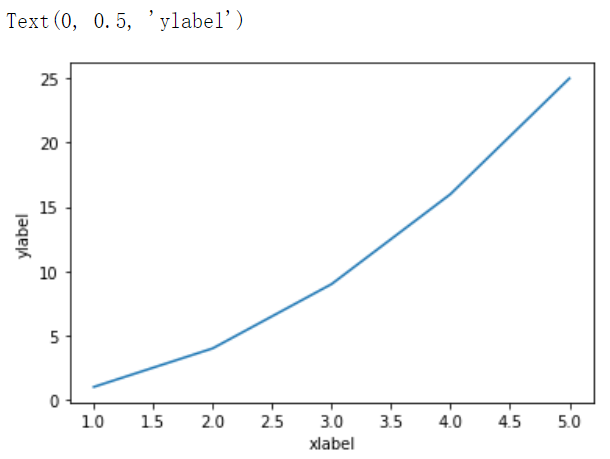
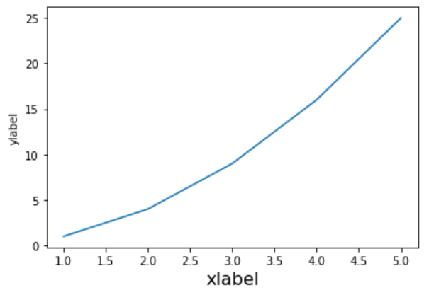
还可以设置横轴字体:plt.xlabel('xlabel',fontsize = 16)
1.2 不同线条的绘制
1.2.1 线条类型
线条类型可以自定义:
| 字符 | 类型 | 字符 | 类型 |
|---|---|---|---|
'-' |
实线 | '--' |
虚线 |
'-.' |
虚点线 | ':' |
点线 |
'.' |
点 | ',' |
像素点 |
'o' |
圆点 | 'v' |
下三角点 |
'^' |
上三角点 | '<' |
左三角点 |
'>' |
右三角点 | '1' |
下三叉点 |
'2' |
上三叉点 | '3' |
左三叉点 |
'4' |
右三叉点 | 's' |
正方点 |
'p' |
五角点 | '*' |
星形点 |
'h' |
六边形点1 | 'H' |
六边形点2 |
'+' |
加号点 | 'x' |
乘号点 |
'D' |
实心菱形点 | 'd' |
瘦菱形点 |
'_' |
横线点 |
plt.plot([1,2,3,4,5],[1,4,9,16,25],'--')
plt.xlabel('xlabel',fontsize = 16)
plt.ylabel('ylabel')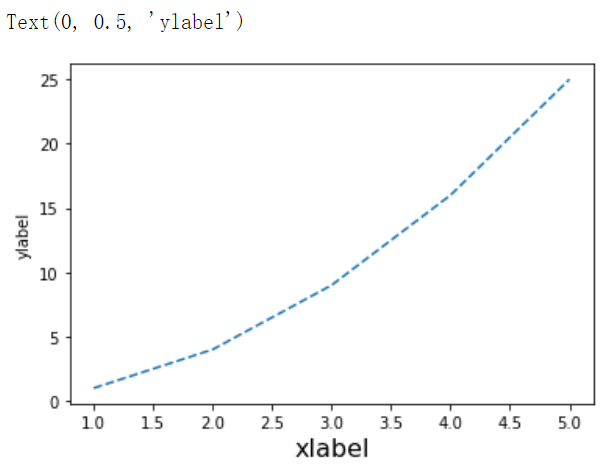
1.2.2 线条颜色
表示颜色的字符参数有:
| 字符 | 颜色 |
|---|---|
‘b’ |
蓝色,blue |
‘g’ |
绿色,green |
‘r’ |
红色,red |
‘c’ |
青色,cyan |
‘m’ |
品红,magenta |
‘y’ |
黄色,yellow |
‘k’ |
黑色,black |
‘w’ |
白色,white |
plt.plot([1,2,3,4,5],[1,4,9,16,25],'-.',color='r')
plt.xlabel('xlabel',fontsize = 16)
plt.ylabel('ylabel',fontsize = 16)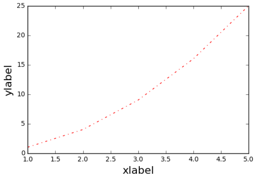
注:
字体和线条类型可以合并书写,如:
plt.plot([1,2,3,4,5],[1,4,9,16,25],'ro'),表示红色线条+圆点型。
1.2.3 绘制多个线
tang_numpy = np.arange(0,10,0.5)
plt.plot(tang_numpy,tang_numpy,'r--')
plt.plot(tang_numpy,tang_numpy**2,'bs')
plt.plot(tang_numpy,tang_numpy**3,'go')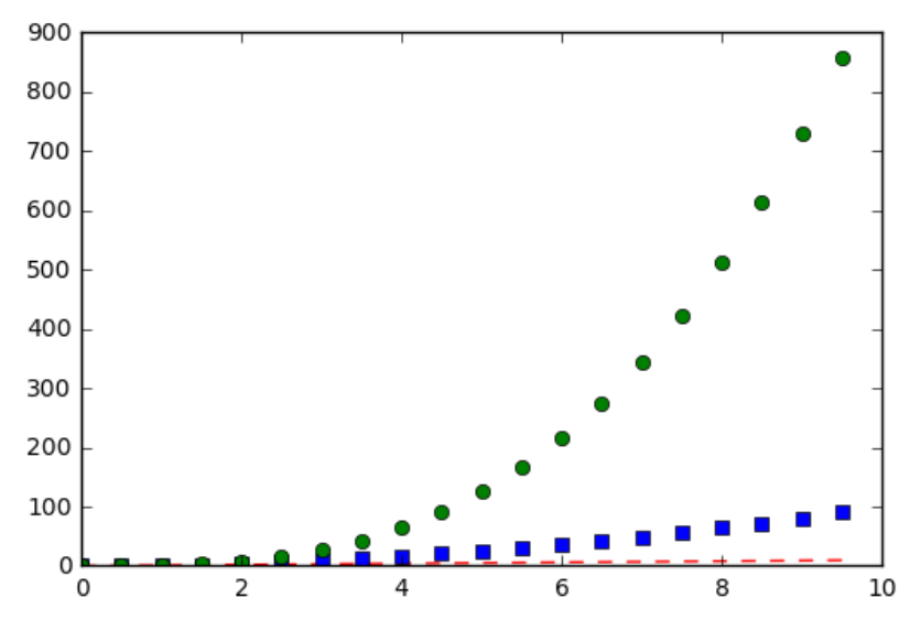
1.2.4 指定线条的宽度
x = np.linspace(-10,10)
y = np.sin(x)
plt.plot(x,y,linewidth = 3.0)			#linewidth指定线条的宽度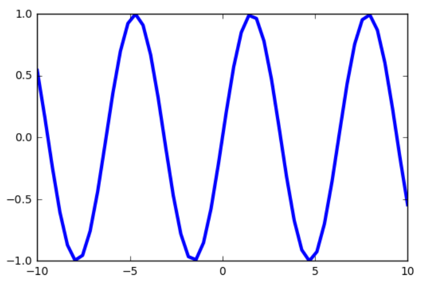
1.2.5 指定修饰和参数
相关修饰:
#markersize代表点的大小
plt.plot(x,y,color='b',linestyle=':',marker = 'o',markerfacecolor='r',markersize = 10)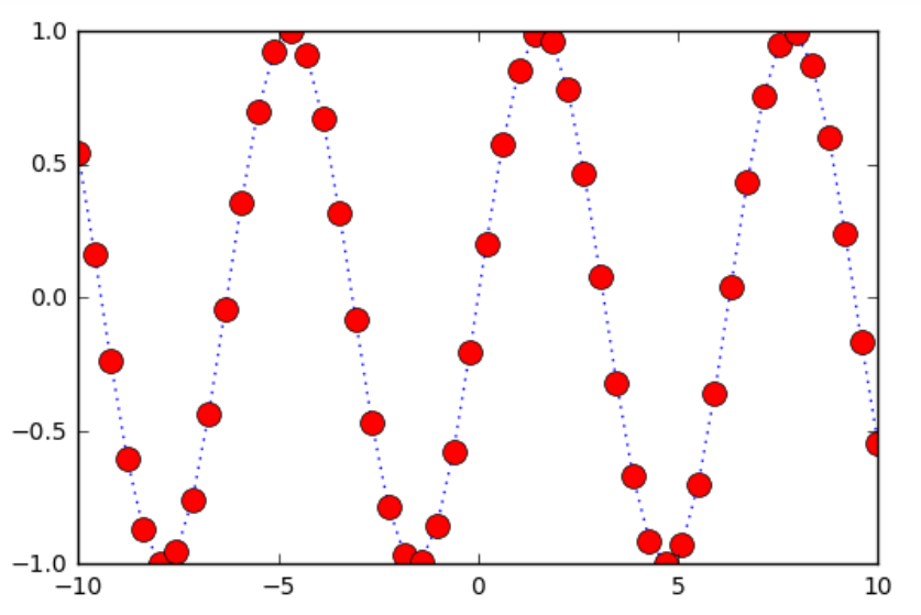
先绘图,再设定参数,使用setp方法:
line = plt.plot(x,y)
plt.setp(line,color='r',linewidth = 2.0, alpha = 0.4)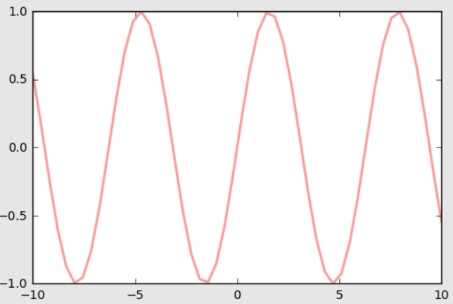
1.3 子图
# 211 表示一会要画的图是2行一列的 最后一个1表示的是子图当中的第1个图
plt.subplot(211)
plt.plot(x,y,color='r')

# 212 表示一会要画的图是2行一列的 最后一个1表示的是子图当中的第2个图
plt.subplot(212)
plt.plot(x,y,color='b')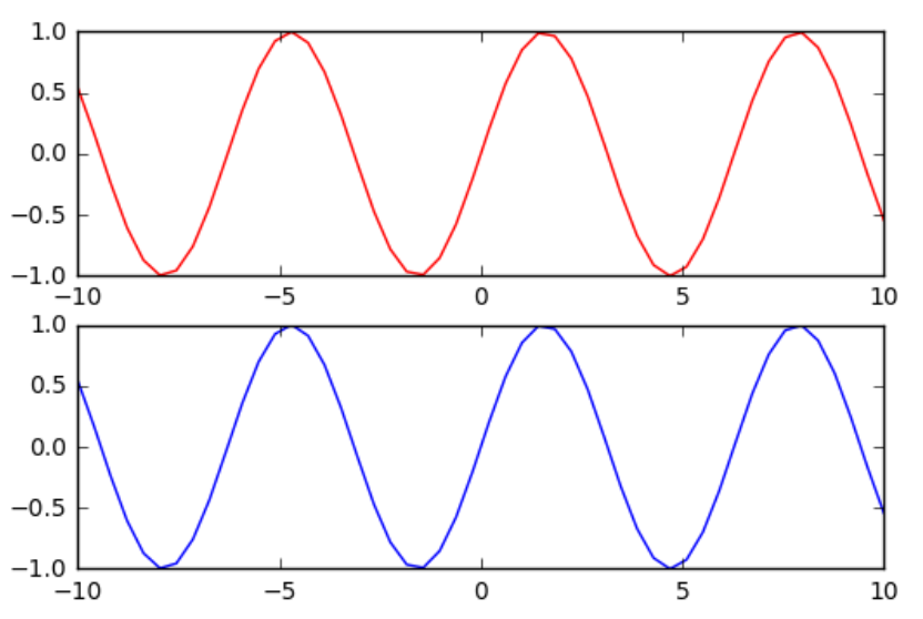
# 121 表示一会要画的图是1行2列的 最后一个1表示的是子图当中的第1个图
plt.subplot(121)
plt.plot(x,y,color='r')

# 122 表示一会要画的图是1行2列的 最后一个1表示的是子图当中的第2个图
plt.subplot(122)
plt.plot(x,y,color='b')
plt.subplot(321)
plt.plot(x,y,color='r')

plt.subplot(324)
plt.plot(x,y,color='b')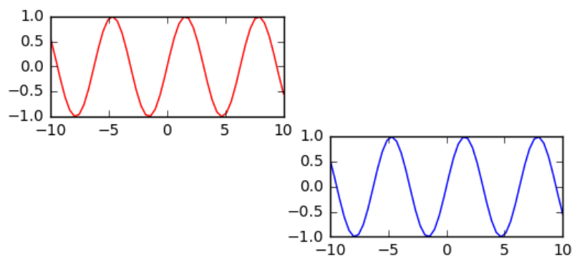
1.4 为图添加注释
plt.plot(x,y,color='b',linestyle=':',marker = 'o',markerfacecolor='r',markersize = 10)
plt.xlabel('x:---')
plt.ylabel('y:---')
plt.title('tang yu di:---')
plt.text(0,0,'tang yu di')
plt.grid(True)														#添加网格
#xy为箭头头端,xytext为注释,facecolor指定箭头颜色,shrink指定箭头长度
plt.annotate('tangyudi',xy=(-5,0),xytext=(-2,0.3),arrowprops = 			 dict(facecolor='red',shrink=0.05,headlength= 20,headwidth = 20))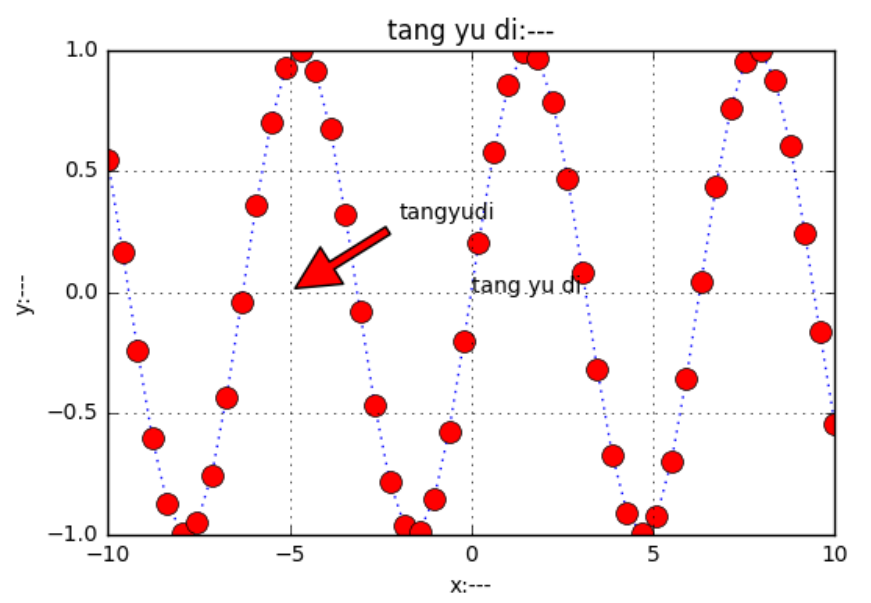
1.5 风格设置
import matplotlib.pyplot as plt
import numpy as np
%matplotlib inline
plt.style.available
['dark_background',
'seaborn-talk',
'seaborn-bright',
'seaborn-ticks',
'bmh',
'ggplot',
'seaborn-darkgrid',
'classic',
'fivethirtyeight',
'seaborn-deep',
'seaborn-colorblind',
'seaborn-muted',
'seaborn-pastel',
'seaborn-notebook',
'seaborn-paper',
'seaborn-dark-palette',
'seaborn-whitegrid',
'seaborn-white',
'grayscale',
'seaborn-dark',
'seaborn-poster']x = np.linspace(-10,10)
y = np.sin(x)
plt.plot(x,y)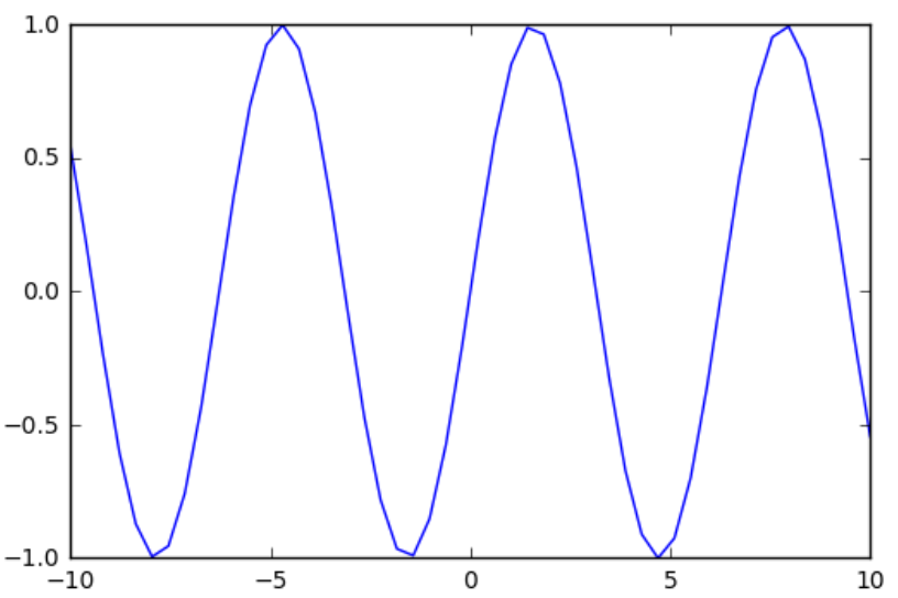
plt.style.use('dark_background')
plt.plot(x,y)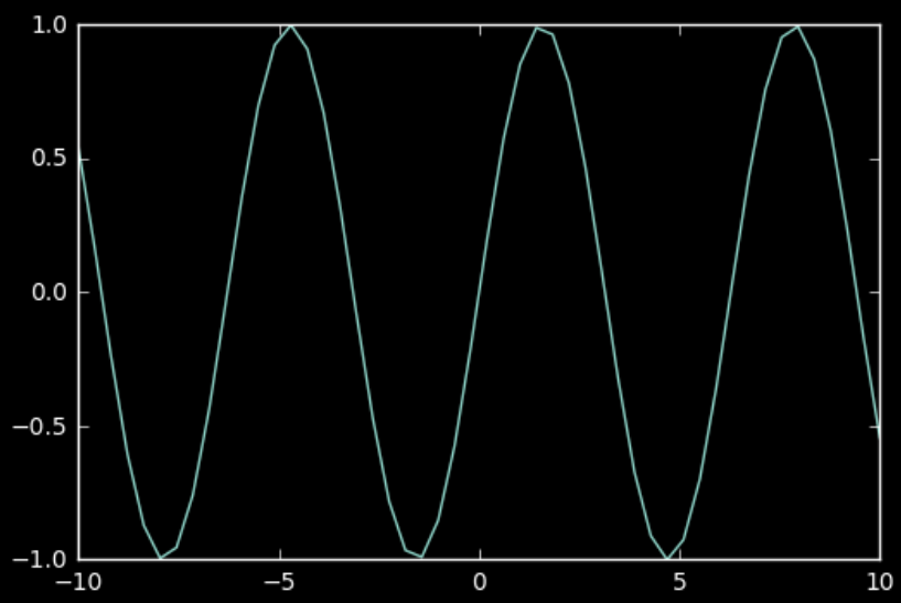
#多种风格混合使用
plt.style.use(['ggplot','bmh'])
plt.plot(x,y)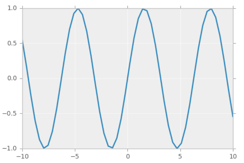
plt.xkcd()
plt.plot(x,y)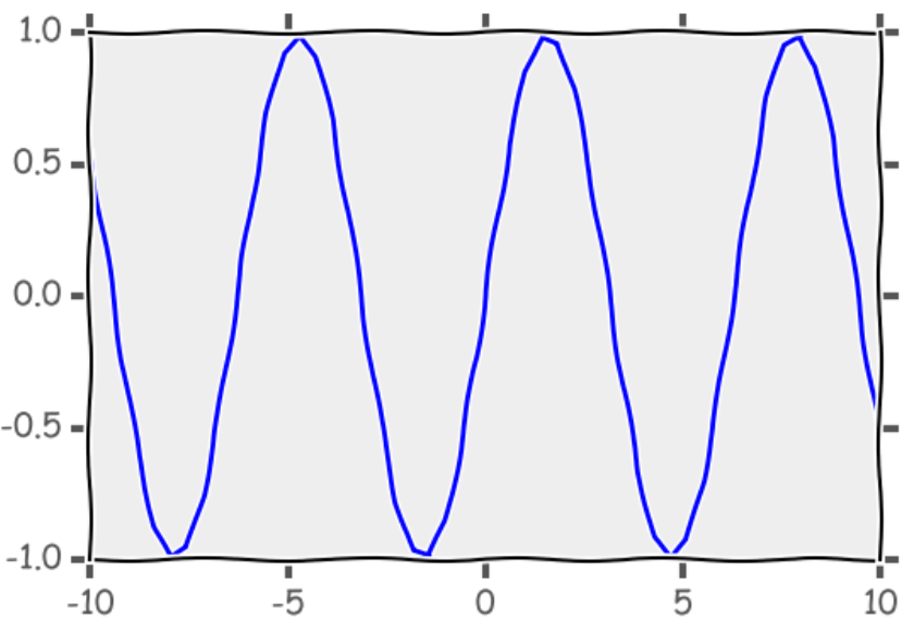
二、条形图
2.1 条形图外观
使用plt.subplots函数时,可以直接在该函数内部设置子图纸信息。
该函数返回两个变量,一个是Figure实例fig,另一个 AxesSubplot实例axes 。**fig代表整个图像,axes代表坐标轴和画的子图,通过下标获取需要的子区域**。
import numpy as np
import matplotlib
matplotlib.use('nbagg')
import matplotlib.pyplot as plt

np.random.seed(0)
x = np.arange(5)
y = np.random.randint(-5,5,5)
print (y)
fig,axes = plt.subplots(ncols = 2)
v_bars = axes[0].bar(x,y,color='red')					#竖着画
h_bars = axes[1].barh(x,y,color='red')					#横着画,横坐标英文:horizontal axis

axes[0].axhline(0,color='grey',linewidth=2)				#从0点位置画线
axes[1].axvline(0,color='grey',linewidth=2)
plt.show()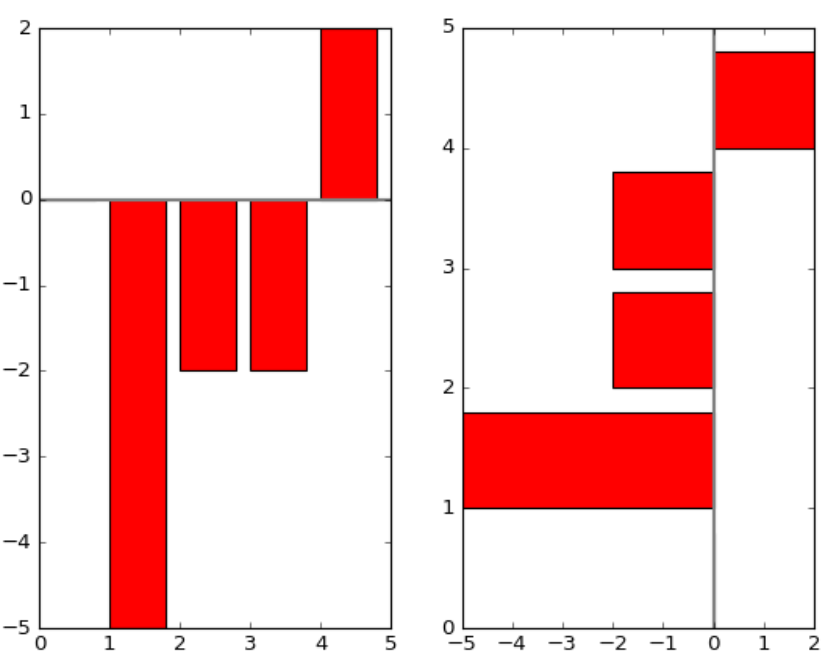
zip()是Python的一个内建函数,它接受一系列可迭代的对象作为参数,**将对象中对应的元素打包成一个个tuple(元组),然后返回由这些tuples组成的list(列表)**。若传入参数的长度不等,则返回list的长度和参数中长度最短的对象相同。
fig,ax = plt.subplots()
v_bars = ax.bar(x,y,color='lightblue')
for bar,height in zip(v_bars,y):
    if height < 0:
        bar.set(edgecolor = 'darkred',color = 'green',linewidth = 3)
plt.show()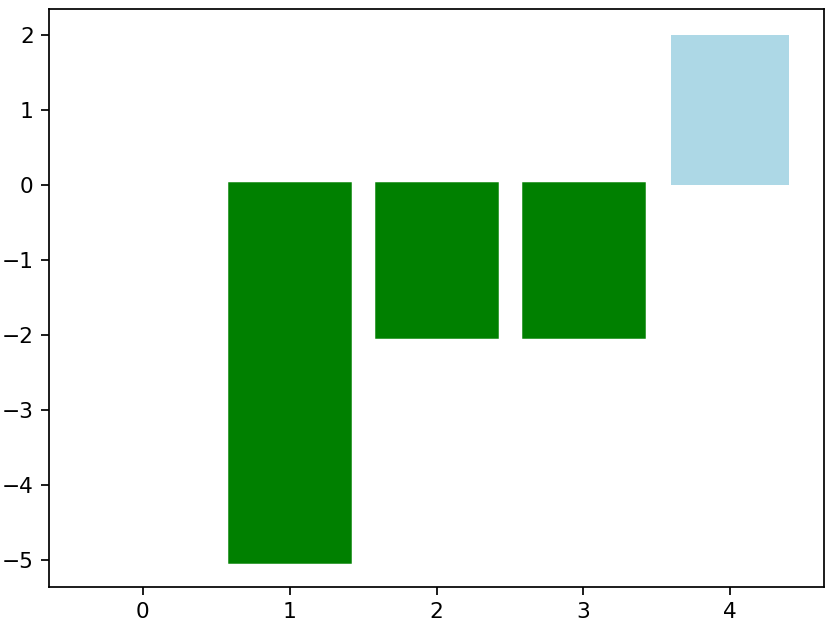
2.2 对图内部进行颜色填充
x = np.random.randn(100).cumsum()				#cumsum()返回给定axis上的累计和
y = np.linspace(0,10,100)

fig,ax = plt.subplots()
ax.fill_between(x,y,color='lightblue')
plt.show()
x = np.linspace(0,10,200)
y1 = 2*x +1
y2 = 3*x +1.2
y_mean = 0.5*x*np.cos(2*x) + 2.5*x +1.1
fig,ax = plt.subplots()
ax.fill_between(x,y1,y2,color='red')
ax.plot(x,y_mean,color='black')
plt.show()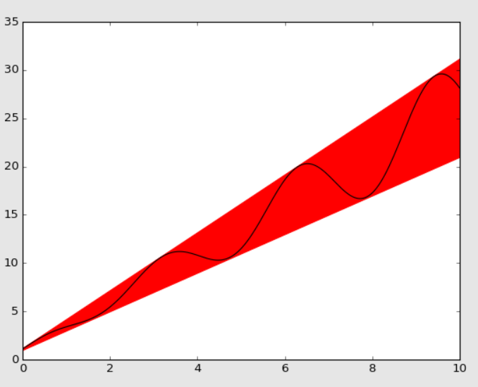
2.3 指定误差范围
xlim()与ylim()——设置数值显示范围【防止条形图数据顶格】:
plt.xlim(xmin,xmax)
plt.ylim(ymin,ymax)
参数说明:
xmin:x轴上的显示下限xmax:x轴上的显示上限
mean_values = [1,2,3]								#指标
variance = [0.2,0.4,0.5]							#可以浮动的范围
bar_label = ['bar1','bar2','bar3']

x_pos = list(range(len(bar_label)))					#len(bar_label)为3
plt.bar(x_pos,mean_values,yerr=variance,alpha=0.3)
max_y = max(zip(mean_values,variance))
plt.ylim([0,(max_y[0]+max_y[1])*1.2])				#设置数值显示范围,不让他顶格
plt.ylabel('variable y')
plt.xticks(x_pos,bar_label)
plt.show()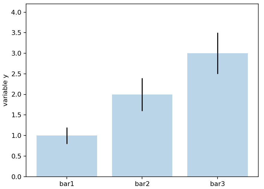
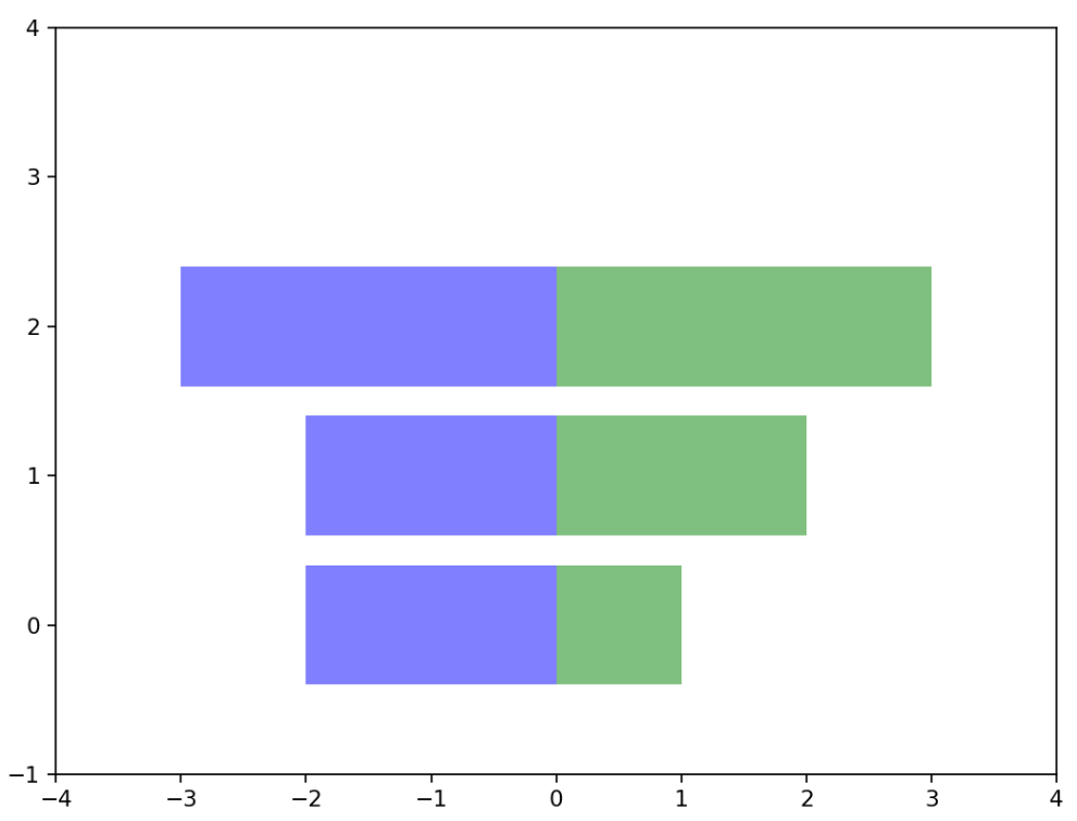
x1 = np.array([1,2,3])
x2 = np.array([2,2,3])

bar_labels = ['bar1','bar2','bar3']
fig = plt.figure(figsize = (8,6))
y_pos = np.arange(len(x1))
y_pos = [x for x in y_pos]
plt.barh(y_pos,x1,color='g',alpha = 0.5)
plt.barh(y_pos,-x2,color='b',alpha = 0.5)

plt.xlim(-max(x2)-1,max(x1)+1)
plt.ylim(-1,len(x1)+1)
plt.show()
2.4 条形图绘制案例
green_data = [1, 2, 3]
blue_data = [3, 2, 1]
red_data = [2, 3, 3]
labels = ['group 1', 'group 2', 'group 3']

pos = list(range(len(green_data)))
width = 0.2
fig, ax = plt.subplots(figsize=(6,4))

plt.bar(pos,green_data,width,alpha=0.5,color='g',label=labels[0])
plt.bar([p+width for p in pos],blue_data,width,alpha=0.5,color='b',label=labels[1])
plt.bar([p+width*2 for p in pos],red_data,width,alpha=0.5,color='r',label=labels[2])
plt.show()
data = range(200, 225, 5)

bar_labels = ['a', 'b', 'c', 'd', 'e']

fig = plt.figure(figsize=(6,4))

y_pos = np.arange(len(data))

plt.yticks(y_pos, bar_labels, fontsize=16)

bars = plt.barh(y_pos,data,alpha = 0.5,color='g')

plt.vlines(min(data),-1,len(data)+0.5,linestyle = 'dashed')
for b,d in zip(bars,data):
    plt.text(b.get_width()+b.get_width()*0.05,b.get_y()+b.get_height()/2,'{:.2%}'.format(d/min(data)))
plt.show()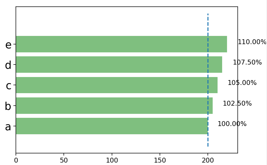
应用ScalarMappable指定颜色:
mean_values = range(10,18)
x_pos = range(len(mean_values))

import matplotlib.colors as col
import matplotlib.cm as cm

#指定多少种数据就有多少种颜色,随意指定即可
cmap1 = cm.ScalarMappable(col.Normalize(min(mean_values),max(mean_values),cm.hot))
cmap2 = cm.ScalarMappable(col.Normalize(0,20,cm.hot))

plt.subplot(121)
plt.bar(x_pos,mean_values,color = cmap1.to_rgba(mean_values))

plt.subplot(122)
plt.bar(x_pos,mean_values,color = cmap2.to_rgba(mean_values))

plt.show()
patterns = ('-', '+', 'x', '\\', '*', 'o', 'O', '.')

fig = plt.gca()

mean_value = range(1,len(patterns)+1)
x_pos = list(range(len(mean_value)))

bars = plt.bar(x_pos,mean_value,color='white')

for bar,pattern in zip(bars,patterns):
    bar.set_hatch(pattern)
plt.show()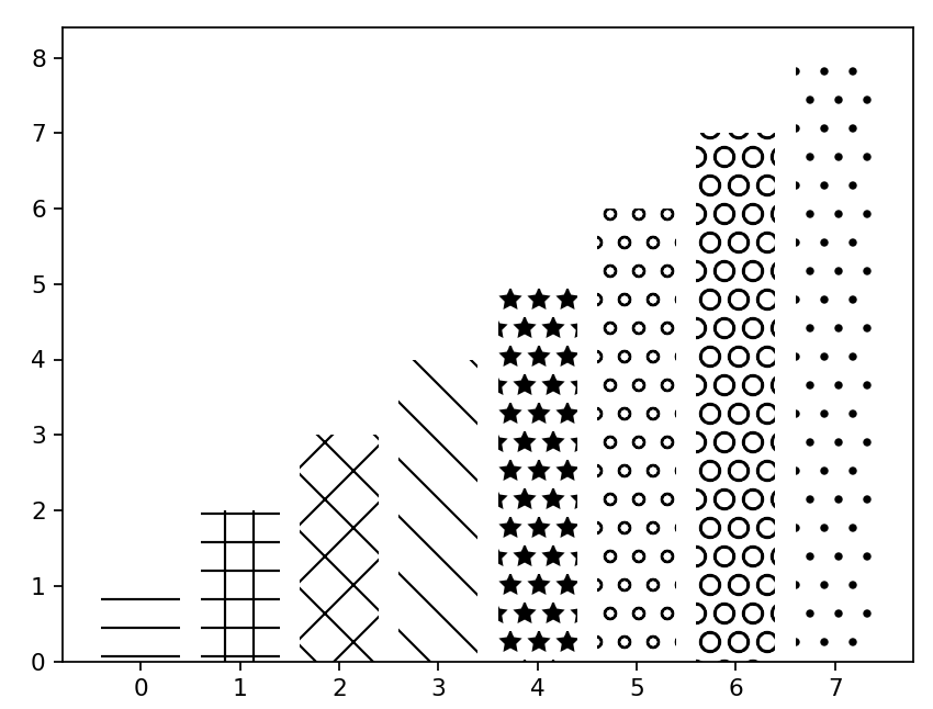
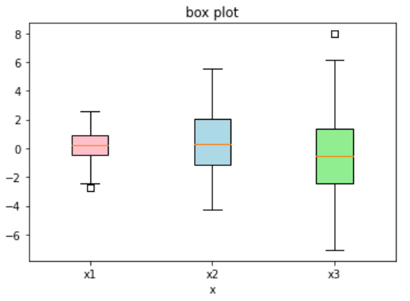
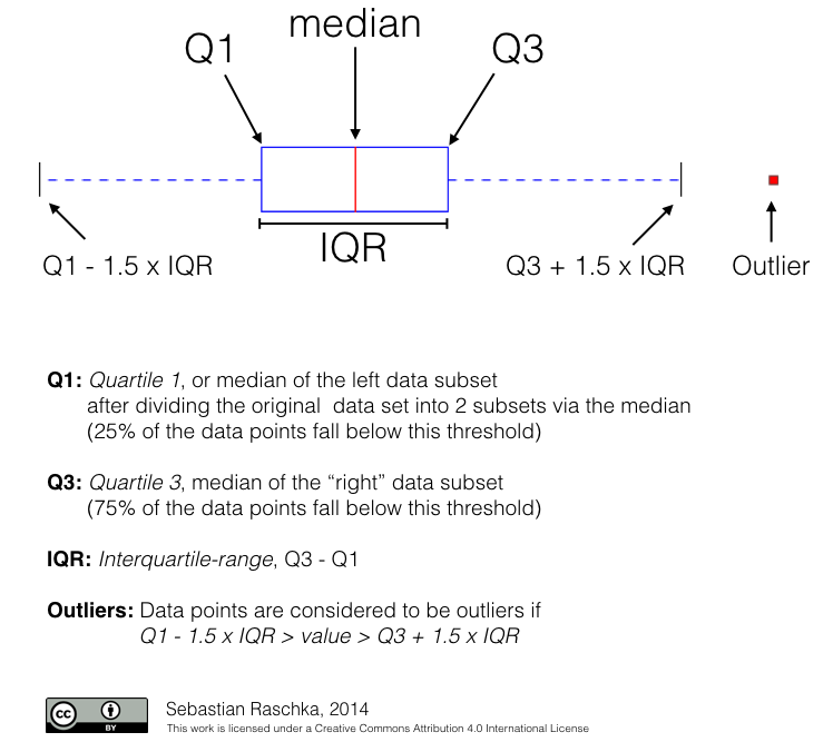
三、盒图
盒图关注的点是1/4四分位点(Q1)、中位数、3/4四分位点(Q3)、离群点等。下图中,Q1 - 1.5 * IQR、Q3 + 1.5 * IQR为离群点。
import matplotlib.pyplot as plt
import numpy as np
tang_data = [np.random.normal(0,std,100) for std in range(1,4)]		#0为均值,std为方差,100为数据量
fig = plt.figure(figsize = (6,4))
plt.boxplot(tang_data,notch = False,sym = 's',vert = True)			#sym = 's',离群点使用方框来表示
plt.xticks([y+1 for y in range(len(tang_data))],['x1','x2','x3'])
plt.xlabel('x')
plt.title('box plot')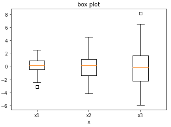
tang_data = [np.random.normal(0,std,100) for std in range(1,4)]
fig = plt.figure(figsize = (8,6))
bplot = plt.boxplot(tang_data,notch=False,sym='s',vert=True)

plt.xticks([y+1 for y in range(len(tang_data))],['x1','x2','x3'])
plt.xlabel('x')
plt.title('box plot')

for components in bplot.keys():
    for line in bplot[components]:
        line.set_color('black')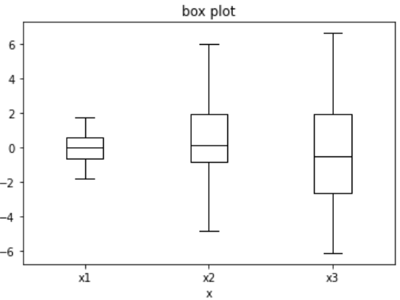
将vert的值从True变为False,重新执行代码:
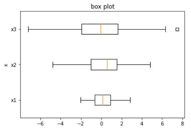
tang_data = [np.random.normal(0,std,100) for std in range(1,4)]
fig = plt.figure(figsize = (6,4))
bplot = plt.boxplot(tang_data,notch=False,sym='s',vert=True,patch_artist=True)

plt.xticks([y+1 for y in range(len(tang_data))],['x1','x2','x3'])
plt.xlabel('x')
plt.title('box plot')

colors = ['pink','lightblue','lightgreen']
for pathch,color in zip(bplot['boxes'],colors):
    pathch.set_facecolor(color)